Table of contents
Overview
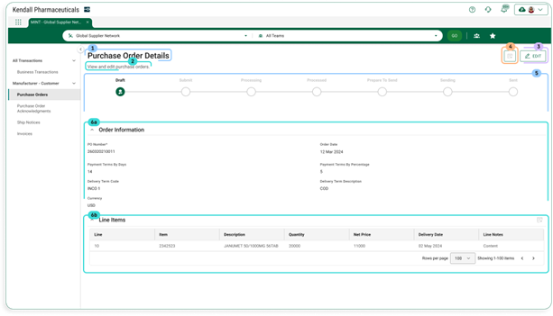
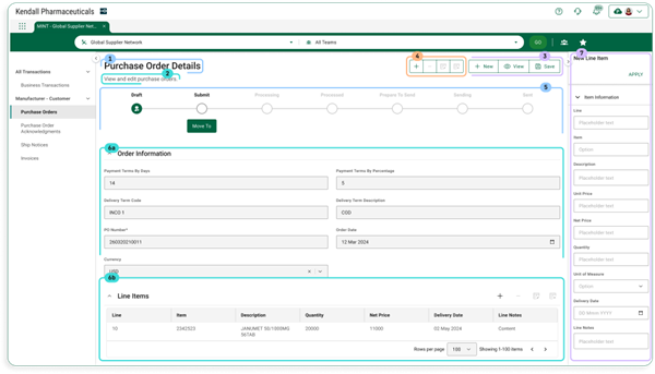
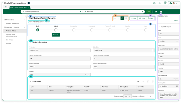
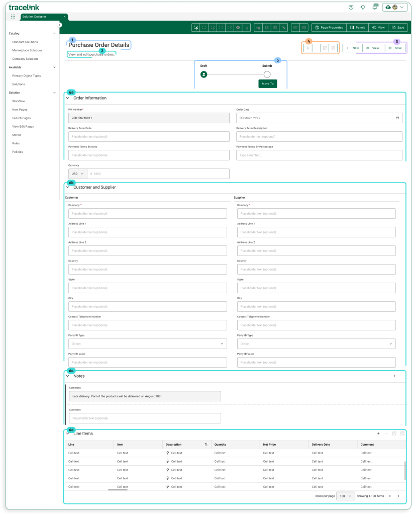
Users view existing instances of object instances using a View/Edit page in view mode. To edit data in the object instance, the user switches to edit mode. The page contains the following elements in both view and edit modes:
- Page title
- Assistive text
- Object operations toolbar
- Collection operations toolbar
- Workflow progress indicator bar
- One or more form sections which contain either:
- Simple fields and groups
- A collections table
- Push panel for collection operations New and Edit
Layout
Sample View Screen (User)
Default View
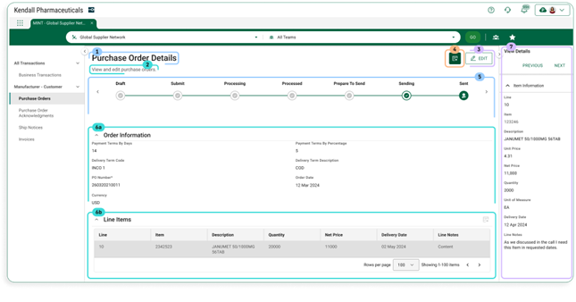
With View Collection Row Push Panel
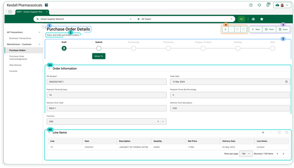
Sample Edit Screen (User)
Default View
With New Collection Row Push Panel
With Edit Collection Row Push Panel
Sample View/Edit Screen (Solution Designer)
Configuration
Page Title
The page title shows the page’s title. The convention is that the value is the object type followed by the word “Details” (e.g. Purchase Order Details).
Contents
| Data Type | Value | Example |
|---|---|---|
| Static Text | [Object Type] Details | Purchase Order Details |
Information for Solution Designers
The page title is a required element that cannot be removed from the page.
Design Conventions
Page title is “[Object Type] Details” (e.g. “Purchase Order Details”).
Configuration Options
Not applicable. The page title element’s design cannot be modified.
Assistive Text
The assistive text is instructional content for the end user. The assistive text is set by the Solution Designer.
Contents
| Data Type | Value | Example |
|---|---|---|
| Static Text | [Set by Solution Designer] | The purchase order’s information is displayed below. To update any of the purchase order’s data, select the Edit button. |
Information for Solution Designers
Assistive text should always be displayed on Search pages.
Design Conventions
| Property | Convention |
|---|---|
| Text length | No more than 100 characters. |
| Writing style | Adheres to the OPUS Writing Guidelines |
Configuration Options
| Property | Parameter | Option | Description |
|---|---|---|---|
| Hidden | On/Off | Off (default) | The page instructions are visible (i.e. not hidden). |
| On | The page instructions are hidden. |
Object Operations Toolbar
The buttons in the object operations toolbar apply to the page or main object, as opposed to the buttons on the collections toolbar, which apply to collections inside the page. The toolbar buttons described below are available on View/Edit pages. As noted, some buttons are only available in View mode and some are only available in Edit mode.
Contents
| Element | Type | Page Mode(s) | Description |
|---|---|---|---|
| Edit | Toolbar Button | View | Selecting this button transitions the page from view mode to edit mode. |
| New | Toolbar Button | View and Edit | Selecting this button navigates to the New page for the object type. If the user was in edit mode, any unsaved changes will be lost. |
| View | Toolbar Button | Selecting this button transitions the page from edit mode back to view mode. Any unsaved changes will be lost. | |
| Save | Toolbar Button | Selecting this button does the following:
|
Information for Solution Designers
Design Conventions
Not applicable. The object operations toolbar design cannot be modified.
Configuration Options
| Applies To | Property | Parameter | Values | Description |
|---|---|---|---|---|
| Toolbar | Hidden | Off/On | Off (default) | The toolbar is visible (i.e. not hidden). |
| On | The toolbar is hidden. | |||
| Toolbar Button | Hidden | Off/On | Off (default) | The button is visible (i.e. not hidden). |
| On | The button is hidden. |
Collection Operations Toolbar
The collection operations toolbar contains actions that apply to collections within the object instance. Collections are a type of data element that can have multiple values within a particular object instance. For example, a collection of transaction IDs contains all transaction IDs that apply to a single Purchase Order. The collection operations toolbar appears at the top of View/Edit pages and above each collection table.
Contents
| Element | Type | Description |
|---|---|---|
| View | Toolbar Button | Selecting this button opens the View Details collection row push panel with data from the selected row in the active collection table. This button is only enabled if a row is selected. |
| New | Toolbar Button | Selecting this button opens the New collection row push panel. |
| Edit | Toolbar Button | Selecting this button opens the Edit collection row push panel with data from the selected row in the active collection table. This button is only enabled if a row is selected. |
| Remove | Toolbar Button | Selecting this button removes the selected row from the active collection table. This button is only enabled if a row is selected. |
Information for Solution Designers
Design Conventions
Not applicable. The collection operations toolbar design cannot be modified.
Configuration Options
| Applies To | Property | Parameter | Values | Description |
|---|---|---|---|---|
| Toolbar | Hidden | Off/On | Off (default) | The toolbar is visible (i.e. not hidden) |
| On | The toolbar is hidden. | |||
| Toolbar Button | Hidden | Off/On | Off (default) | The button is visible (i.e. not hidden). |
| On | The button is hidden. |
Progress Indicator
The progress indicator is an optional component that illustrates the state of the object instance. This is particularly useful for objects that go through a workflow. For example, a Purchase Order object may go from “To Do” (i.e. not started) to “In Progress” to “Done.”
Contents
| Element | Sub Element | Type | Description |
|---|---|---|---|
| Active State | State Name | Text | The name of the state (e.g. ”To Do,” “In Progress”). Configurable by the Solution Designer. |
| State Icon | Icon | Indicates the state is active. | |
| Non-active State | State Name | Text | The name of the state (e.g. ”To Do,” “In Progress”). Configurable by the Solution Designer. |
| State Icon | Icon | Indicates the state is not active. |
Information for Solution Designers
Design Conventions
| Property | Convention |
|---|---|
| First state name (i.e. the initial state of the object) | Use “To Do” |
| Last state name (i.e. the state of the object when the workflow is completed) | Use “Done” |
Configuration Options
| Applies To | Property | Values | Description |
|---|---|---|---|
| Progress Indicator | Hidden | Off (default) | The indicator is visible (i.e. not hidden) |
| On | The indicator is hidden. | ||
| Progress Indicator | Number of states | Number | The number of states in the workflow. |
| State | State Name | Text | The name of the workflow state to display. |
Form Section
A form section contains a form header and either:
- A combination of simple fields (e.g. Name, ID) and groups (a predefined set of logically connected fields)
- A collections table (described in the Collections Table section)
Contents
| Element | Type | Description |
|---|---|---|
| Section Name | Text | The name of the section. |
| Section Inputs | Simple fields and groups or Collections table | A section can contain a combination of simple fields and groups or a single collections table. A collections table cannot be mixed with other inputs. |
Information for Solution Designers
Design Conventions
| Property | Conventions |
|---|---|
| Section Layout Columns | Fields inside TraceLink form groups can either appear in a one-column layout (with long fields) or a two-column layout (with shorter fields). |
| Section Name | Use descriptive nouns for group names (e.g. “Shipping Address”). Do not include verbs in the section name. If the page has only one section, hide the section name because it will be redundant with the page title. |
| Section Fields and Groups | Each section should contain logically connected fields and groups. The best practice is to have between 3 and 8 fields per section.
|
Configuration Options
| Applies To | Property | Parameter | Values | Description |
|---|---|---|---|---|
| Section Header | Hidden | Off/On | Off (default) | The header is visible (i.e. not hidden). |
| On | The header is hidden. | |||
| Section Header | Collapse | Off/On | On (default) | The section can be collapsed and expanded. The corresponding icons are present. |
| Off | The section cannot be collapsed and expanded. The corresponding icons are not present. |
Collection Table
A collection is a particular data element that can have multiple values within a particular object instance. For example, a Purchase Order object instance might have multiple transaction IDs, thus transaction IDs are a collection inside the Purchase Order object. Each collection inside an object is displayed in its own collections table.
Contents
| Element | Type | Description |
|---|---|---|
| Table Fields | Field List | The ordered set of fields contained in the table. |
| Table Field | Text, Select List, or Date/Time | An individual field for entering data to an item in the collection. |
Information for Solution Designers
Design Conventions
| Property | Convention |
|---|---|
| Field Order | Key fields that help identify a particular row (e.g. Name, ID) should appear first (leftmost). Fields that are less likely to be used to identify a row (e.g. Date, Description) should appear after the key fields. |
Configuration Options
Not applicable. The collection table design cannot be modified.
View Collection Row Push Panel
The View Collection Row Details push panel (accessed by selecting the View Details icon on the Collection Toolbar when a row in an active collections table is selected) provides a means for users to view all the data in a particular collection row. This component is only accessible when the screen is in View mode.
Contents
| Area | Element | Description |
|---|---|---|
| Header | Push Panel Title | “View Details” static text. |
| Previous Button | Shows the details for the previous collection row in the table. | |
| Next Button | Shows the details for the next collection in the table. | |
| Close Button | Selecting this button closes the push panel. | |
| Push Panel Content | Field List | All fields that are displayed in the push panel. The fields that appear here can be set in the OPUS Solution Environment (OSE). |
| Field (inside Field List) | The label and corresponding data entry field. |
Information for Solution Designers
Design Conventions
| Property | Convention |
|---|---|
| Field List | The push panel should contain the same fields that are in the collection table. |
| Field List Order | The order of the fields in the push panel should match the order of the fields in the corresponding collection table. |
Configuration Options
The user sets the push panel field contents per the above conventions.
New Collection Row Push Panel
The New Collection Row push panel (accessed by selecting the New icon on the Collection Toolbar when a collections table is active) provides a means for users to add a new data row to a collection.
Contents
| Area | Element | Description |
|---|---|---|
| Header | Push Panel Title | “New” static text. |
| Apply Button | Validates the user’s entries (e.g. ensures values supplied for all required fields) and then:
| |
| Close Button | Selecting this button closes the push panel. | |
| Push Panel Content | Field List | All fields that are displayed in the push panel. The fields that appear here can be set in the OPUS Solution Environment (OSE). |
| Field (inside Field List) | The label and corresponding data entry field. |
Information for Solution Designers
Design Conventions
| Property | Convention |
|---|---|
| Field List | The push panel should contain the same fields that are in the collection table. |
| Field List Order | The order of the fields in the push panel should match the order of the fields in the corresponding collection table. |
Configuration Options
The user sets the push panel field contents per the above conventions.
Edit Collection Row Push Panel
The Edit Collection Row Details push panel (accessed by selecting the Edit icon on the Collection Toolbar when a row in an active collections table is selected) provides a means for users to edit a row in a collection.
Contents
| Area | Element | Description |
|---|---|---|
| Header | Push Panel Title | “Edit” static text. |
| Apply Button | Validates the user’s entries (e.g. ensures values supplied for all required fields) and then:
| |
| Close Button | Selecting this button closes the push panel. | |
| Push Panel Content | Field List | All fields that are displayed in the push panel. The fields that appear here can be set in the OPUS Solution Environment (OSE). |
| Field (inside Field List) | The label and corresponding data entry field. |
Information for Solution Designers
Design Conventions
| Property | Convention |
|---|---|
| Field List | The push panel should contain the same fields that are in the collection table. |
| Field List Order | The order of the fields in the push panel should match the order of the fields in the corresponding collection table. |
Configuration Options
The user sets the push panel field contents per the above conventions.


