Table of contents
Empowering OPUS Solution Designers with OPUS Ensemble Patterns
User Context
Seamlessly Keep User and Company Information in View
User Context Overview
UI Patterns
Labeling Patterns
Configuration
Navigation
Navigating TraceLink's Internet of Supply Chains
Navigation Overview
UI Patterns
Navigating to a Network or Solution
Labeling Conventions
Actionable Takeaways
Configuration
Actionable Takeaways
Content Area
User Focus in the New Content Area
Content Area Overview
UI Patterns
Labeling Conventions
Configuration
Toolbar and Push Panel
Enhancing Everyday Efficiency With Streamlined Operations and Push Panels
Toolbar and Push Panel Overview
UI Patterns
Configuration
Empowering OPUS Solution Designers with OPUS Ensemble Patterns

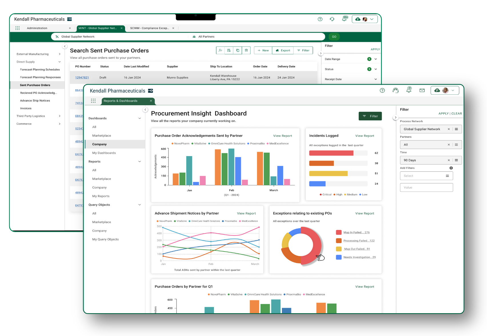
OPUS Solution Designers must understand OPUS Ensemble Patterns, as they lay the foundation for a holistic user experience. OPUS Ensemble is TraceLink’s first next-generation OPUS solution, seamlessly integrating user context, personalized settings, powerful navigation, and company-specific details, providing instant access to settings, notifications, help, and support. With intuitive, browser-like tabs and TraceLink's unique network navigation system, OPUS Ensemble offers a streamlined and efficient user journey, ensuring you have everything you need to do your job efficiently while keeping everything in view that is important and relevant to you.
User Context
Seamlessly Keep User and Company Information in View
Ensuring you have constant access to your account and company information is essential to make sure you are working in the appropriate context in your day-to-day job. OPUS Ensembles' fixed user context area includes an account picker that allows you to easily switch between multiple environments and companies, a user toolbar where resources for help and support are located, notifications about important updates and alerts, and a prominently displayed company logo that reinforces your company’s brand identity. Grouping these contextual elements ensures your vital information and tools are kept within easy reach, thereby improving efficiency and engagement.
User Context Overview
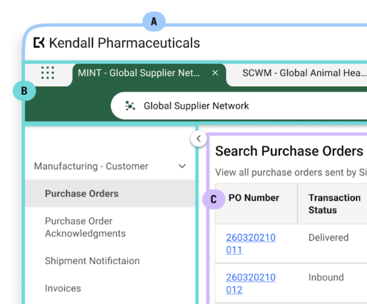
The topmost part of the screen includes the following 3 main elements:
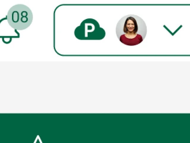
- TraceLink Account – Your TraceLink Account is always viewable at the top of the screen, so you are always aware of your current context, including both your current environment and profile picture. This also helps streamline your company’s validation workflow. From here, you can access the following features:
Note: Most users will default to their single company but may have multiple environments to choose from. For example, a user from Kendall Pharmaceuticals may have access to both validation and production.- Accounts – Access to your different TraceLink accounts so you can quickly switch your environment and/or company while always keeping the current setting in view.
- Settings – Access your personalized settings where you can access your user profile, notifications settings, version information and more.
- Log Out – You can also log out from the TraceLink Account picker.
- User Toolbar – Includes the following resources:
- Help – Opens help for the current solution in a new browser tab.
- Support – Opens your customer support portal, if you are a TraceLink customer. If you are a Partner on the TraceLink Network, you are brought to the support request form on TraceLink.com.
- Notifications – Launches the Notifications push panel that contains read and unread notifications for any solution where you have notifications enabled for that TraceLink account.
- Company Information – Reflects either your company’s logo or your company name if a logo was not added during your company’s onboarding process to the TraceLink Network.
UI Patterns
All members of the TraceLink Network have constant access to their company context, supporting resources, notifications, and TraceLink Account information (in that order from left to right).
This comes out of the box for all users and compliments all solution experiences. If you are a Solution Designer, there is no action to take for your solution to leverage this pattern.
Labeling Patterns
Labels in this area require no action; the information you see varies based on your company’s information and your account information (including which environments you have access to).
- TraceLink Account indicates <environment> <company name> in the drop-down and is represented visually through the cloud icon and profile picture in the top-right, for the selected account. “P” represents a production environment, and “V” represents a validation environment.
- All resources in the user toolbar contain alt text (e.g. Help, Support, and Notifications).
- If a company logo is not available, your company name displays textually in place of the logo.
Configuration
If you are a Solution Designer, there are no configuration options for items in the user context area. If you are looking for more information related to the elements that are viewable in this area, explore the TraceLink Administration resources.
If you are a TraceLink Administrator that manages your company’s information and user accounts, you have the ability to change the company name and logo in the Company Profile and may get contacted by your colleagues for user account support.
Tip: If you are a user and the information you see is incorrect while logged in, check your profile settings (accessible from your TraceLink Account picker) to confirm that your user information is accurate. For issues with account access or incorrect company information, contact your TraceLink Administrator.
Navigation
Navigating TraceLink's Internet of Supply Chains
TraceLink's navigation experience stands apart by placing the power of digital collaboration at your fingertips with just a few simple clicks. By seamlessly linking you and your company to your Partners across the supply chain as part of a vast ecosystem, TraceLink streamlines collaboration processes that accelerate decision making, drive operational excellence, and improve patient outcomes. Through the vehicle of TraceLink's network composer, your navigation flow is unlike any experience out there. Learn more below to unlock the full potential of digital collaboration within TraceLink's supply chain network.
Navigation Overview
- Main Menu – Your journey begins with the main menu, which serves as the central hub for accessing networks, Partner networks, and your enterprise solutions. With intuitive organization and clear categorization, you can swiftly select different products, whether a multienterprise or enterprise solution.
- Tabs – Selecting an entry in the main menu opens a tab, which offers a streamlined way to traverse between various networks and solutions. These tabs offer quick-click access to different views and contexts (including different Partner contexts), enhancing flexibility and productivity. Like any browser experience, when you log out for the day and then log back in the following day, your sessions resume precisely where you left off, facilitating a swift start to your day by saving you countless clicks before getting started.
- Network Composer – TraceLink's network composer acts as a digital collaboration hub, allowing you to select your desired network and Partners with unparalleled ease. Through intuitive design and robust features, you can effortlessly select, visualize, and facilitate your real-world relationships, fostering seamless digital collaboration.
Note: If the solution you select is an enterprise solution (e.g. Administration, Master Data, Compliance Reporting), then the network composer will not display below the tab, as you are working solely within your company’s context and not with Partners across the TraceLink Network.
- Side Menu – The side menu augments the navigation experience, displaying all processes (represented by menu items) you have access to. Each of these menu items represents a business object (e.g. Purchase Orders, Invoices, Payments) you have access to within the context of the network and Partner you have selected in the network composer. The side menu also offers granular control and configuration options when your company licenses OSE. OSE empowers Solution Designers to tailor the user’s navigation experience, including configurable structures and labels, through the use of role-based access controls.
UI Patterns
Navigation Interactions and Flows
Your experience will differ depending on if you are using an enterprise product to work within your company or if you are digitally collaborating with Partners and locations on the TraceLink Network (within a multienterprise product). In addition to whether the network composer displays beneath the tab, the way you interact with your tabs may change subtly. The following sections dive deeper into each of these nuances.
Navigating to a Network or Solution
Navigating to a Network
When navigating to a network, the only visible and interactive difference in your journey is the network composer. This unique but powerful tool is how the TraceLink Network enables digital collaboration between you and your supply chain trade partners.
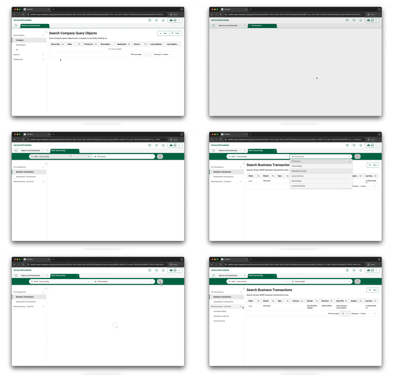
Here are the keys to the interaction:
- Your journey begins by selecting either My Networks or Partner Networks from the main menu. A new tab with the network composer displays.
- Select the desired network (which the owning company within the network defines) from the Network drop-down. This dictates which Partners will be available in the Partner drop-down. If there is only one Link for that network, then the Partners field defaults to that Partner. If there is more than one Link, then it defaults to "All Partners".
- Once your selections are made, select the GO button, and the tab label, side menu, and content area refresh with the appropriate information.
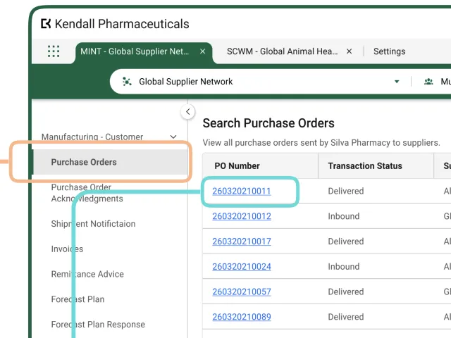
- The tab label reflects the solution name (e.g. MINT) and the selected network name. In the example, you’ll see MINT - Global Supplier Network.
- The side menu contains all of your processes that are available within that network and for the Partner selected. For example, a MINT network may contain purchase orders, invoices, and payments between a manufacturer (Owner) and their supplier (Partner). All of these processes would be available in the side menu.
- If you are logging in for the first time, your menu item will default to the first in alphabetical order. If you are a returning user, it will pick up where you left off in your last session. The content area displays with search results for that process or displays the last active page from your previous session (e.g. View Purchase Order 12345).
Navigating to an Enterprise Solution
The following describes navigating to an enterprise solution.
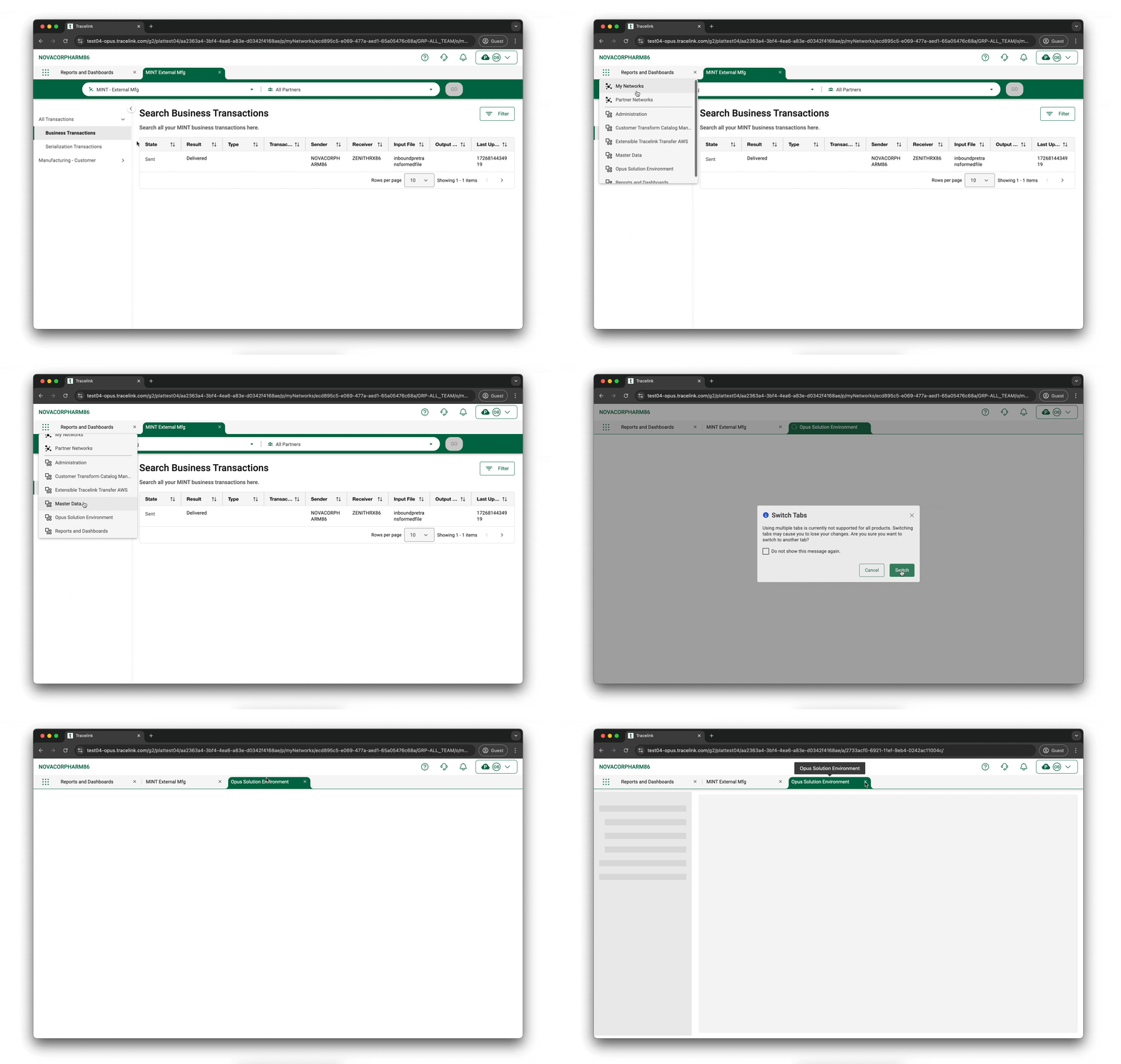
Here are the keys to the interaction:
- Your journey begins by selecting the main menu, where a list of all enterprise solutions you have access to is displayed below the network options. Select the desired solution.
A new tab displays (without a network composer). - The tab label reflects the solution name (e.g. Administration, Master Data) and the default process in the side menu.
- The side menu contains all of your processes available within that enterprise solution. For example, if you are a TraceLink Administrator, all of the items you need to administer your company are available in the side menu (e.g. Networks, Links, Users). If you are logging in for the first time, your menu item will default to the first in alphabetical order. If you are returning after logging out, it will pick up where you left off in your last session.
- The content area displays with the Search page from the selected menu item (e.g. Links) or the last active page from your previous session.
Navigating Within a Network or Solution
Your overall journey will depend on what you are trying to accomplish, but the navigation experience within an enterprise solution or network is consistent. Every solution and network uses the same types of pages to accomplish the same types of tasks.
In most cases, selecting an item in the side menu opens a Search page to search across multiple object instances (e.g. searching across all POs). If there will only ever be one instance of an object (e.g. a user’s profile), the side menu item opens the View/Edit page for the object instance.
The Search page displays a table containing details about the object instances you can access. From a Search page, you can perform any of the following actions:
- You may want to search for one or more object instances that are not currently visible in the Search page. In this case, you can enter search criteria and search for the desired object instances.
- You may want to create a new object instance. In this case, you can select the New button to open a New screen, which contains a blank form where you can enter details about the object instance. For example, if your inventory of syringes is low, you can create a new PO that you will later send to your supplier. After you finish creating the new object instance, you are taken to the View/Edit page for the object instance where you can see the information you just entered.
- You may want to view more information about a specific object instance. In this case, you can select it in the Search page and select the View button, which opens a View/Edit page that shows the details about the object instance. For example, you can select a specific existing PO (e.g. PO 12345) to open the View/Edit page and verify that the supplier’s information is correct.
- You may want to edit a specific object instance. In this case, you can select it in the Search page and select the Edit button, which opens a View/Edit page where you can edit the details of the object instance. For example, if you discover that the supplier information for PO 12345 is incorrect, you can edit the PO, correct the information, and save the PO.
After you create or edit an object instance, you are taken to the View/Edit page for the new or edited object instance so you can review the details you just entered.
Regardless of the actions you take in the main content area of the screen, the side menu remains unchanged and the type of object you are working with is always visible. At any time, you can return to the object’s Search page by selecting the object in the side menu.
It is a best practice to always save any changes you make before leaving your current screen or tab.
There are, of course, other routes your journey may take. You can continue to create new object instances from within a View/Edit page or return to the View/Edit page from an Edit page without saving your updates. You can pivot to a different location in your solution entirely, but the scenarios we have presented are the most likely.
Navigation Interaction and Flow Considerations for Solution Designers
As a Solution Designer, the navigation experience is entirely object-driven which automatically drives the navigation experience for your users through the vehicle of the side menu, the metadata-driven page types, and the page operations (e.g. New, Edit) associated with those page types. This feature is called auto navigation. You can not do much to configure your navigation other than to follow the conventions of the side menu and the Labeling sections. Remember that associating Search pages to your menu items is a key criterion to getting your solution added to the marketplace.
Keep in mind the type of solution you are creating (enterprise or multienterprise), and that there are differences in navigation between the two. The solution shows up in the right part of the main menu and has tab labels based on the applied solution name and solution short names as defined in your data model. If the main menu or tabs have the wrong label, it means your model needs to be updated.
Where you will want to put the most thought is in the labeling and organization of your side menu to ensure the main interactions within the side menu match your users’ real-world perspective and mental models. Refer to the Labeling section below to learn more.
Navigation Troubleshooting for TraceLink Administrators
As a TraceLink Administrator, you may encounter issues from colleagues or Partners where they are unable to find their desired solution in the main menu or the tab label appears to be incorrect. You may also be asked for help if someone can’t find their desired network or Partner. Typically, you will need to go to Administration to confirm that the user has access to the correct networks and solutions or determine if the user has an incorrect expectation about the naming. You may need to liaise with the Solution Designer if the navigation or role-based access controls are preventing your user from finding what they are looking for.
Labeling Conventions
How To Label Menus
Submenus and menu items in the side menu have display labels that can be configured by Solution Designers in OSE. Each menu item label should represent one business object (e.g. Purchase Orders, ASNs, Invoices) and submenus with like-menu items should offer context on the orchestration or use case from the perspective of the user and what role they play in the supply chain.
In the image above, you see all business objects relating to External Manufacturing from the MAH perspective. This example has menu items listed in the happy path of the orchestration, starting with forecasts, purchase orders, purchase order acknowledgements, invoices, and payments.
Be intentional in your labeling. Conduct a competitive analysis or refer to industry content for guidance. Consider each persona’s role on the TraceLink Network, because the context of that individual may shift based on their role in the supply chain and the perspective of Owners, Partners, or in some cases when an Owner also serves as a Partner.
You can reuse the same label if the same business object appears under different submenus as long as the context remains relevant. It will not be redundant based on the submenu context above it.
Actionable Takeaways
- Competitive analyses will arm you with the domain knowledge necessary to name your submenus and menu items in a way that makes sense to the user based on the role they play in the supply chain and their typical process flows.
- Consider the role of the company and the user in the TraceLink Network. How you name and order your items may change based on whether the Owner or Partner perspective is more useful to the user.
- Menu item display names must reflect the business object (e.g. Forecasts, Purchase Orders).
- Menu items can be grouped under submenus that are labeled intentionally based on the real-world use case (e.g. External Manufacturing).
- Submenus and menu items should be ordered by the typical orchestration flow. For example, if you work in procurement, you should start with examining forecast information before placing your order.
Configuration
Solution Designers must put extra thought into their menu structure before jumping to the menu configuration in OSE. A menu is never just a menu. A menu is a vehicle for the information architecture of your product. Per usability.gov, information architecture (and, by extension, menu design) “…focuses on organizing, structuring, and labeling content in an effective and sustainable way.” Here is everything you need to know to construct menus consistent with TraceLink’s experience.
For the Main Menu
The solution and network name for multienterprise networks are not displayed until the user selects either My Networks or Partner Networks in the main menu. No action is required in OSE to configure this behavior. Enterprise solutions will display below the line in alphabetical order and reflect the applied solution name in your model.
For Tabs
As a Solution Designer, you want to ensure that the applied solution name and solution short name information in your data model are correct so that they display in the main menu item and tabs with the correct name.
For the Network Composer
Remember that TraceLink Administrators who manage their company's networks hold the controls for the company-defined network names and the Partner names that will show up in the network composer. These are configured through the Administration and Master Data solutions. Solution Designers and TraceLink Administrators need to collaborate to ensure the solutions and configurations are working properly during the testing, deployment, and support of the solution.
For the Side Menu
There are 3 levels of the side menu that are configurable in OSE: menus, submenus, and menu items. Only submenus and menu items are visible to your users. These can be configured as follows:
- Use role assignments to specify which roles have access to which menu items (implicitly through the top-level menu container). Put thought into what Owners and Partners should and should not see so that when your roles are applied to the menu, those details are enforced.
- Do not mix menu items with and without submenus to maintain consistency and enhance scannability and understandability. Your side menu should either display a flat list of menu items or submenus with menu items below them. Refer to the section above for labeling guidelines on how to name and order these menus.
Actionable Takeaways
- Refer to the Labeling section before configuring your menus in OSE so names and ordering patterns are consistent.
- Ensure your roles are properly defined so that when they are applied to the menu, users see and don’t see what is appropriate (e.g. Owner users may see everything, and Partners may see only a subset).
- Ensure the applied solution name and solution short name reflect the appropriate name in the data model so they display in the main menu and tab labels correctly.
- TraceLink Administrators define the network names visible in the network composer, along with which Partners are linked in that network (and therefore which Partner names display).
- Organize the side menu either as a flat list of menu items or as a set of submenus with menu items. Do not mix and match so you can be consistent and maintain a clean hierarchy.
Content Area
User Focus in the New Content Area
The content area is designed to be the central hub for all information, where you can access and manage your information in various types of pages and take action on it. It is your main focal point and the place where the majority of your interaction time is spent. This area is user-friendly and organized, ensuring efficient navigation and task completion. The layout is responsive and reacts to other interactions such as the side menu opening and closing, the push panel opening and closing, and the browser shrinking or growing in size. All pages within this area are consistent in layout, task flows, and in-page navigation for a cohesive user experience.
Content Area Overview
There are 3 main elements to be aware of within the content area:
- The main content area, where you can view and interact with your business objects through a Search page, View/Edit page, and New page.
- A toolbar where all available operations (i.e. actions) are located. These actions typically trigger a push panel from the right-hand side to either filter or modify information at the page or field-level. In some cases, like the New operation, a new page will open where you can create a new object instance.
- A push panel, which is a panel that opens and closes on the right side of the screen, where you can perform additional actions related to the objects in the main content area. The size of the main content area responds to the push panel, ensuring that it is not obstructed by the push panel and all information remains in view.
UI Patterns
A user will see the following page types within the content area:
- Search page (typical default landing page)
- New page
- View/Edit page
When opening a solution, the user should always land on the Search page, except in the following cases:
- There will only ever be one instance of an object (e.g. a user’s profile). In this case, the View/Edit page is shown. For example, a company profile will only ever be one object, so the system will navigate straight to the View/Edit page.
- A user has a different page open, logs out of their session, and logs back in. In this case, the last active page from their previous session is displayed.
Labeling Conventions
Labeling and content organization patterns for pages within the content area of the OPUS Ensemble experience are addressed in the Page Type conventions.
Configuration
Configuration for pages within the content area of the OPUS Ensemble experience is addressed in the Page Type conventions.
Toolbar and Push Panel
Enhancing Everyday Efficiency With Streamlined Operations and Push Panels
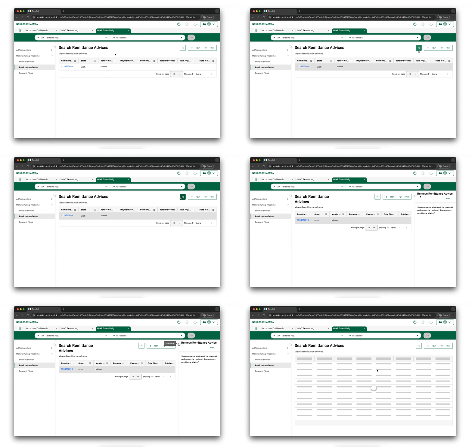
The toolbar within the content area is a versatile tool that provides quick access to various operations (i.e. actions). These operations can trigger actions directly on the current page or open a push panel from the right side, offering additional functionality such as viewing information, uploading files, or configuring properties. The content area, toolbar, and push panel work in concert to maximize efficiency and productivity.
Toolbar and Push Panel Overview
- Toolbar – A central location where all operations are grouped, performing various tasks on the page or in the push panel.
- 1.1 - Object Operations
- 1.2 - Page Operations
- Operations – Actions are categorized and represented by icons and labels for easy access. An operation refers to an action performed on or with a specific object, typically manipulating, interacting with, or retrieving information from the object to achieve a particular outcome.
- Push Panel – Enhances the user interface by providing additional functionality without leaving the current page. It slides in from the right side of the content area, offering a dynamic space for various tasks, such as viewing and interacting with information.
UI Patterns
Main Interaction
- If there is a page-level or new object type operation, these will always be in an active state, ready for interaction. For example, you can create a new purchase order at any time from a Search page.
- If there is an object or collection-level operation, you must first select the field, group, or collection you’re intending to add (always available at the section-level) or modify. For example, you must first select the collection table for line items before adding a new line item.
Tip: See the different Page Type Design and Definition pages for design conventions regarding which operations are included by page type.
Toolbar
- Presence – Always present with 1–3 groups in the top right of the page.
- Consistency – The ordering of groups, UI treatment of those groups, and the operations themselves cannot be configured by the Solution Designer and must remain as defined below.
- Operations – Operations either cause the push panel to appear or initiate interaction with the content on the page. The operations toolbar is divided into the following 4 groups, based on the scope of the operations:
- Page Operations – Actions taken at the page level relate to the current business object, such as creating a new object, filtering on the current page, or importing and exporting data. This makes it easy to interact and complete quick tasks in the context of the complete business object.
- Trigger Push Panel – For example, on a Search page, the Filter operation opens the push panel, where you can filter all purchase orders by status.
- Navigate to New Object page - For example, when you select the New operation, you will be brought to a New page to create a new object instance based on the object type context you were in on the search page. For example, if you select the New button from the Search Purchase Orders page, you are brought to a New Purchase Order page.
- UI Treatment – These items must always display an icon to the left paired with text to the right of the icon.
- Object Operations – Contextual actions related to data manipulation within the current object. This ensures all changes to data are in proximity to the relevant information in the object you are interacting with.
- Direct Actions – Some toolbar operations trigger immediate actions on the current page, such as editing content while editing an existing object instance (e.g. changing the quantity on a purchase order).
- UI Treatment – These must display an icon only (with alt text).
- Collection Operations – Actions related to manipulating data in a collection (e.g. table, list) within the current object. This ensures all changes to data are in proximity to the relevant information you want to interact with.
- Direct Actions – These operations immediately trigger the push panel, which allows you to edit information with a collection (e.g. adding a line item to a purchase order, which renders as the collection table).
- UI Treatment – These must display an icon only (with alt text).
- New Object Type Operation – Creating new objects within the existing object context, designed for efficiency and to prevent redundant data entry.
- New Object Type – When selecting an operation from this group, a user can create a new object instance of a different kind of object from within the existing object (e.g. creating a purchase order acknowledgement from within an existing purchase order).
- UI Treatment – These display as text only.
- Page Operations – Actions taken at the page level relate to the current business object, such as creating a new object, filtering on the current page, or importing and exporting data. This makes it easy to interact and complete quick tasks in the context of the complete business object.
- Responsiveness – As the viewport narrows, each group truncates to show one operation and a dropdown icon to the right. The left-most item will be in view at the break, while all other options will be available upon selection of the dropdown.
Push Panels
The push panel is a responsive area within the content area that allows you to view and complete your tasks efficiently without obstructing any relevant information in front of you.
- Interaction – The push panel is opened when certain operations in the toolbar are selected and is closed by selecting a chevron icon or clicking outside the push panel area, with smooth animations enhancing the user experience.
- Page-level operations:
- Filtering
- Creating new objects
- Viewing object details
- Removing objects
- Bulk imports and exports
- Collection-level operations:
- Adding items
- Removing items
- Creating new collections (only available to Solution Designers)
- Editing existing collection items
- Object-level operations:
- Following and unfollowing object instances
- Viewing the details of an object instance
- Copying fields
- Removing object instances
- New object type operations:
- Creating a new object instance from the information in the current object instance.
Labeling Conventions
Labeling and content organization patterns for the toolbar and push panel within the content area of the OPUS Ensemble experience are addressed within each Page Type convention, as well as in the UX Content section.
Operations
Here is a quick reference of the superset of options by page type for a holistic view. The operations below are ordered from left-to-right (the same as the UI):
Search Page Type Toolbar
- New Object Type-Level - N/A
- Object-Level:
- Follow/Unfollow (toggle)
- View Details
- Copy
- Remove
- Collection-Level - N/A
- Page-Level:
- New
- Import
- Export
- Filter
New Page Type Toolbar
- Object Type-Level - N/A
- Collection-Level – These operations are specifically used for collections (these render as lists or tables):
- Add
- Remove
- Edit
- Object-Level - N/A
- Page-Level:
- New
- Save and New
- Save
View Page Type Toolbar (View Mode)
- New Object Type-Level:
- This will vary based on the user's context. For example, if a user is viewing a purchase order (PO), they may see buttons for PO Acknowledgment, ASN, and Invoice, allowing them to quickly create new object types based on the current information.
- Collection-Level:
- View Details
- Object-Level - N/A
- Page-Level:
- New
- Edit
View/Edit Page Type Toolbar (Edit Mode)
- New Object Type-Level:
- This will vary based on the user's context. For example, if a user is viewing a purchase order (PO), they may see buttons for PO Acknowledgment, ASN, and Invoice, allowing them to quickly create new object types based on the current information.
- Collection-Level:
- Add
- Remove
- Edit
- Object-Level - N/A
- Page-Level:
- New
- View
- Save
See Optimizing Solution Delivery With Predefined Object Operations in OPUS more information on operations.
Configuration
Configuration for the toolbar and push panels is detailed within each Page Type convention, ensuring consistency and effectiveness across different contexts.


